Thursday 22 October 2015

Reflection Straight Images / Work Diary -

Reflection -
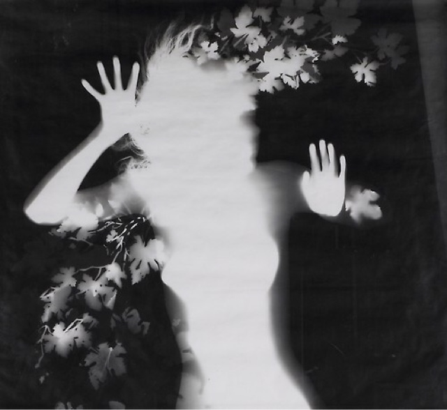
All of these images were taken under the theme of reflection. The images feature a variety of reflections from mirror to window and water. The first image below is inspired by Vivian Maier and her self portrait photographs.


I am pleased with this particular image as it is evident that it is inspired by Vivian Maier's self portrait photography. Additionally, I am pleased with the tone of the image as the reflection appears a tinted blue whilst the red bricks create a contrast. If I were to improve this picture then I may edit it in photoshop and make it black and white so that a viewer would understand the direct link and inspiration from Maier's work.


I am satisfied with the overall appearance of this image as the reflection is focused and detailed and due to the composition and rule of thirds the viewers' eye is automatically drawn to the reflection. I am pleased with this image and would possibly experiment with editing it into black and white using Photoshop CC 2014 however I would happily leave this image as it is.


I like this photograph as not only is the theme of reflection the main focus of the image it is also representative of framing. I am pleased with this image because the reflection of the eye is the only part of the image in focus, as I used a narrow depth of field, but it also fits well into the three part grid system thus drawing viewer attention directly to the eye. Furthermore, I am satisfied with the composition of the photograph as it is an 'Over the Shoulder' angle / perspective.


I am pleased with this image as it is an example of reflection but also of analogous colours due to the use of yellows and greens. Furthermore, the use of the puddle frames the reflection of the light and this image also fits into the the grid cross-section and is composed well. 


This is the final of my favourite five images as the reflection is somewhat distorted. Additionally, this is one of my only images where the object being reflected is also depicted in my photograph. However, if I were to improve this image I would possibly edit it in Photoshop and adjust the contrast to make the reflection more exaggerated.

Progression - 

To improve from this point I would further study reflection in the style of other photographers. Vivian Maier is a good example of a portrait photographer who utilises reflection to study self identity. I would like my reflection work to be more implicitly studying social groups. 

Tuesday 20 October 2015

Reflection Contact Sheet -

Reflection -


Reflection Image Bank -

Reflection -

Francesca Woodman : 
Francesca Woodman entitles her reflection work 'Self-deciet' and the images appear to share the theme of being dishevelled, monochrome and full of sorrow.


Thursday 15 October 2015

Shape Studio Straight Images/ Work Diary Edited -

Shape Studio Work -
All of these images were edited using Photoshop CC 2014 and I completed this by using a variety of tools and techniques. I began by creating a new layer from the background so that I could edit the image, next I chose the 'Create New Fill or Adjustment Layer' and selected 'Black & White'. Then, I went up to the 'Brightness / Contrast' tool and adjusted my photos accordingly until I was satisfied.


This image is intriguing as the object itself is rectangular and I have physically manipulated it to create a curved shape. 


This photograph is interesting as it depicts compositions of shapes to form banal everyday items that are often overlooked. My inspiration came vaguely from Jeff Koons who had a series called 'Banality'. 


I like this photograph as the shape is physically constructed and then flattened into the 2D medium of photography alongside the already 2D example of shape related to the shadows. 


This photograph uses shape in relation to shadows. 

Progression - 

To improve from this point, I would have attempted to create more intriguing shapes and shadows using the prior formed shapes. Also, the editing of these images into black and white did add to the images although I could have taken it a step further by further increasing the 'Brightness/ Contrast'. 

Shape Studio Contact Sheet -

Shape Studio Work -


Tuesday 13 October 2015

Shape Straight Images / Work Diary -

Shape Edited- 
These images were all taken by me inspired by the formal element of shape specifically the geometric shape found in architecture. I then edited these images using Photoshop CC 2014. Once the images were opened I made a new layer 'Layer 0' do that I could apply changes. Next, I went down to the 'Create New Fill or Adjustment Layer' and chose 'Black & White'. Afterwards, I chose the 'Brightness/ Contrast' and upped the contrast to add to the contours of shape. I am pleased with the overall appearance of these images as the range of highlights and lowlights adds to the outlines and definition of the various shapes inspired by the geometric shape photographers Flavio Samelo and Thomas Hawk.


I like this image as the converging lines draw the viewers eye to the centre of the image after panning up. The audience is taken on a journey. The perspective is almost surreal as the image simultaneously gives both the impression of looking down and up. The monotone colour and strength of the 'Brightness/ Contrast' gives the image a striking aesthetic. 


This photograph is interesting as the composition of the converging lines, diagonal and horizontal all combine with the rectangular and triangular shapes to create a final outcome which is pleasing. 


This image gives the impression of infinity due to the composition of looking up at the angular towering shapes that allow the audience to feel small. 


This image is particularly striking in my opinion due to the share point that the image reaches which is achieved by the lines leading to the edge of the rectangular building. Also the smaller windows serve as examples of shape and add detail to the photograph. 


This final image is composed in a way that merges many shapes together in a precise chaotic ensemble. The triangle serves as the central subject of the image and the tonal difference allows for the stark lines to be shown more accurately. 

Progression - 

To improve from this point I would also shoot in a location that features shapes other than angular sharp shapes. If I went to a location such as London I could photograph the curved architecture and add more depth to my project. I would also like to photograph in the studio to add another dimension to my response. 


Shape Contact Sheet -

Shape -


Shape Image Bank -

Shape Image Bank with Examples -

Floris Neususs -
Neususs studies the irregular shape of the human body and uses figures that are not defined as an individual but only as a shape fromed by contours and lines. 


Bill Brandt -
Brandt also photographs the irregular shape of humans focusing specifically on the female form. This can either be viewed as art or sexual objectification of women. 


Thomas Hawk - 
Hawk studies geometric shape in modern and old architecture.
Another notable geometric shape photographer is Flavio Samelo who works in black and white much like Hawk and similarly studies architecture and the shapes found in modern life.


Thursday 8 October 2015

Tone Studio Straight Images / Work Diary Edited -

Tone Studio Edited -
For all of the images below I used the same technique to edit them. Using Photoshop CC 2014 I made a new layer over the background image and labelled it 'Layer 0'. Next I went down to 'Create New Fill or Adjustment Layer' and selected 'Hue and Saturation' sliding the 'Saturation' bar down to the left thus turning my image black and white. As some of the images appeared too dark or too light using this method I returned to the 'Create New Fill or Adjustment Layer' and chose 'Brightness/ Contrast' where I used both of the sliding bars to adjust the image to my liking. Occasionally I will add a muted colour to my work by using the 'Colour Balance' tool and altering the hue.


Progression -


To improve from this point in the formal elements journey I would firstly change the composition of some images. The chair supporting the objects is obscuring some of the implied meaning. I would also increase the 'Brightness/ Contrast' in Photoshop on some of the images.

Tone Studio Straight Images / Work Diary -

Tone Studios -
These photographs were all taken based upon the formal element of tone. These images were created in a photography studio where I was able to change the lighting to add to the depth and contours of my subject. I am satisfied with 'The Gas Mask', 'The Knife' and 'The Broken Doll' specifically as I was most pleased with the lighting on these three in comparison to my other two images. If I were to alter these images I would edit them so that they are in black and white, using Photoshop CC 2014, thus exaggerating the tone through the se of highlights and lowlights.


I like this image as the warm tones contrast to the cool connotations of china and dolls. The shadow across the face of the doll implies a darkness to the photograph although this is undermined by the warm colour undertones. 


This image again is a good example of tone and also implicitly low key lighting. One half of the gas mask is hidden in darkness. 


This is the favourite of my images joint with the one image below. This photograph is good at exemplifying natural tone. The lighting creates a tonally pitch black backdrop and the snoot focusing the light on the hand and knife creates areas of light and dark tone. 


This photograph is joint favourite as the broken doll works well in unison with the formal element of tone. The extreme contrasts between light and dark tones create an eerie atmosphere. 


This final image is my least favourite simply due to the composition although the subject implicitly critiques the differences and similarities between masculinity and femininity. 

Progression - 

To improve from this point in the formal elements journey I would firstly change the composition of some images. The chair supporting the objects is obscuring some of the implied meaning. I would also increase the 'Brightness/ Contrast' in Photoshop on some of the images. I would also edit the images into black and white to emphasise the tonal variations. 

Tuesday 6 October 2015

Tone Straight Images/ Work Diary Edited -

Tone Edited -


This image shows tone as the light of the studio is emphasising the highlights and lowlights thus giving the picture good contrast and tonal qualities. If I was to improve this image then I may change it to black and white and up th contrast in photoshop to exaggerate the tone even more.


I also like this image and believe it depicts tone as the background of the image is very tonally dark whilst the subject itself is closer to the white end of the spectrum. This image also features transitioning light between the highlights and lowlights.


This image shows tone through the contrast of the writing and the background of the wall. This photo could also be put into black and white to exaggerate the tonal differences featured in the image.


My final image features tone through the contrast of the dark tonal figure and the light tone background.  This could again be improved by turning the image black and white to emphasise the highlights and lowlights.


This photo also depicts tone through the use of portrait and street photography very much like the photographer Mortiz. This image could possibly be improved by increasing the contrast adding to both the highlights and lowlights.

Progression - 

To improve upon this particular photoshoot I would re-evaluate my understanding of tone. Tone is the overall lightness or darkness of an image and I chose to focus simply on the darkness of photography. The studio images are good for tone as the environment can easily be controlled in relation to lighting which provided a platform for creating the formal element of tone. If I completed this shoot again I would focus solely on shooting in the studio environment. In the future I would also focus on the warmth or coolness of an image in reference to tone.

Tone Straight Images / Work Diary -

Tone -


This image shows tone as the light of the studio is emphasising the highlights and lowlights thus giving the picture good contrast and tonal qualities. If I was to improve this image then I may change it to black and white and up th contrast in photoshop to exaggerate the tone even more.


I also like this image and believe it depicts tone as the background of the image is very tonally dark whilst the subject itself is closer to the white end of the spectrum. This image also features transitioning light between the highlights and lowlights.


This photo also depicts tone through the use of portrait and street photography very much like the photographer Moritz. This image could possibly be improved by increasing the contrast adding to both the highlights and lowlights.


This image shows tone through the contrast of the writing and the background of the wall. This photo could also be put into black and white to exaggerate the tonal differences featured in the image.


My final image features tone through the contrast of the dark tonal figure and the light tone background.  This could again be improved by turning the image black and white to emphasise the highlights and lowlights.

Progression - 

To improve upon this particular photoshoot I would re-evaluate my understanding of tone. Tone is the overall lightness or darkness of an image and I chose to focus simply on the darkness of photography. The studio images are good for tone as the environment can easily be controlled in relation to lighting which provided a platform for creating the formal element of tone. If I completed this shoot again I would focus solely on shooting in the studio environment. In the future I would also focus on the warmth or coolness of an image in reference to tone.